In the evolving world of web design, choosing the right fonts for your creative agency website is essential to make a lasting impression on your audience. Fonts play a crucial role in conveying the personality and professionalism of your brand. Finding the perfect font pairing can be a daunting task, but fear not! In this article, we will explore the top 10 font pairings that are perfect for creative agency websites in 2024. Whether you’re looking for a bold and modern look or a classic and timeless feel, these font combinations have got you covered.
Table of Contents
Understanding Font Pairing
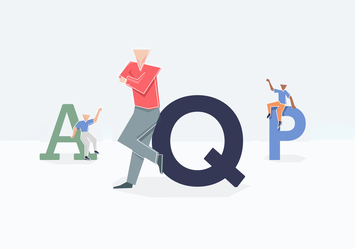
Font pairing is the art of selecting two or more typefaces that complement each other, creating visual harmony and hierarchy while maintaining readability and legibility. When done correctly, font pairing can enhance the overall visual appeal of a website and improve user experience, making it easier for visitors to navigate and consume content. With countless font options available, choosing the right combination can be challenging, but understanding the basic principles of font pairing and experimenting with different combinations can yield impressive results.
The Benefits of Font Pairing for Creative Agency
Font pairing is the art of combining different typefaces in a complementary manner to create a harmonious and visually appealing design. For creative agency websites, effective font pairing is essential because it:
Enhances Visual Appeal
A well-designed font pairing adds visual interest and hierarchy to your website, making it more attractive to potential clients and setting you apart from competitors. A visually appealing website can help attract more clients, increase engagement, and ultimately lead to higher conversion rates and business growth.
Improves User Experience
By choosing well-paired fonts, you can ensure readability and legibility across your website, making it easier for users to find relevant information about your services, portfolio, and team. This can lead to increased user satisfaction, longer time spent on your site, and a higher likelihood of users returning or recommending your agency to others.
Reinforces Brand Identity
Consistent typography not only reinforces brand recognition but also builds trust among your target audience. Skillful font pairing helps maintain brand consistency by using typefaces that align with your agency’s branding and values. When users can easily identify and connect with your brand, they are more likely to become loyal customers and advocates for your creative services.
Examples of Effective Font Pairing on Real Estate Websites
Playfair Display and Lato
Playfair Display is an elegant serif font with a touch of sophistication, while Lato is a clean, minimalist sans-serif typeface designed for readability. This pairing creates a harmonious balance between classic and modern styles, making it ideal for creative agency websites that want to convey both professionalism and creativity.
Why it works: The contrast between the serif and sans-serif fonts adds visual hierarchy and interest, while the legibility of both typefaces ensures a user-friendly experience.
Montserrat and Roboto
Montserrat is a modern, geometric sans-serif font, while Roboto is a versatile sans-serif typeface with excellent readability. This combination creates a sleek, contemporary look that reflects the cutting-edge nature of the creative industry.
Why it works: The similarity in style between the two fonts creates consistency, while the subtle differences in weight and structure add depth and visual interest.
Oswald and Raleway
Oswald is a bold, condensed sans-serif font that commands attention, while Raleway is an elegant sans-serif typeface with a touch of sophistication. This pairing works well for creative agency websites that want to make a strong statement and showcase their unique design sensibilities.
Why it works: The contrast between the condensed sans-serif and the elegant sans-serif fonts adds visual variety and emphasizes important information, while the legibility of both typefaces ensures a smooth user experience.
Poppins and Open Sans
Poppins is a geometric sans-serif font that exudes modernity, while Open Sans is a versatile sans-serif typeface designed for readability. This pairing creates a clean, minimalist look that reflects the creative industry’s forward-thinking nature.
Why it works: The combination of a geometric sans-serif font with a clean sans-serif font achieves a balance between form and function, ensuring a professional and polished appearance.
Abril Fatface and Source Sans Pro
Abril Fatface is a bold, display serif font with a touch of vintage charm, while Source Sans Pro is a sleek sans-serif typeface with a modern feel. This combination works well for creative agency websites that want to create an attention-grabbing yet approachable design.
Why it works: The contrast between the display serif and the sans-serif fonts adds visual interest and hierarchy, while the legibility of both typefaces ensures a user-friendly experience.
Bebas Neue and Karla
Bebas Neue is a strong, all-caps sans-serif font, while Karla is a highly legible sans-serif typeface. This pairing creates a bold and dynamic look, perfect for creative agency websites that want to make a strong impression.
Why it works: The combination of an all-caps sans-serif font with a clean sans-serif font adds visual variety and emphasizes important information, while the legibility of both typefaces ensures a smooth user experience.
Amatic SC and Josefin Sans
Amatic SC is a unique, hand-drawn display font, while Josefin Sans is a geometric sans-serif typeface with excellent readability. This combination works well for creative agency websites that want to showcase their personality and stand out from the competition.
Why it works: The contrast between the hand-drawn display font and the geometric sans-serif font adds visual interest and hierarchy, while the legibility of both typefaces ensures a user-friendly experience.
Futura and Avenir
Futura is a classic geometric sans-serif font, while Avenir is a versatile sans-serif typeface designed for readability. This pairing creates a timeless yet contemporary look, suitable for a wide range of creative agency websites.
Why it works: The similarity in style between the two fonts creates consistency, while the subtle differences in weight and structure add depth and visual interest.
Libre Baskerville and Montserrat
Libre Baskerville is a versatile serif typeface designed for readability, while Montserrat is a modern, geometric sans-serif font. This combination creates a harmonious balance between traditional and contemporary styles, making it ideal for creative agency websites that want to convey both professionalism and innovation.
Why it works: The contrast between the serif and sans-serif fonts adds visual hierarchy and interest, while the legibility of both typefaces ensures a user-friendly experience.
Archivo Black and Nunito
Archivo Black is a bold, sans-serif typeface with a strong presence, while Nunito is a friendly, rounded sans-serif font. This pairing works well for creative agency websites that want to create an approachable and engaging online presence.
Why it works: The contrast between the bold sans-serif and the rounded sans-serif fonts adds visual interest and hierarchy, while the legibility of both typefaces ensures a user-friendly experience.
Testing and Implementing Font Pairings on Creative Agency Websites
To test and implement these suggested font pairings on your creative agency website, consider using tools like Google Fonts or Adobe Fonts, which offer a wide range of free and premium typefaces. Experiment with different combinations and preview them on your website to see how they affect the overall design and user experience.
Also Read: Designer’s Guide: Mastering Contrast, Hierarchy, Balance, and Movement
Remember that the key to successful font pairing is finding the right balance between visual interest and readability. Don’t be afraid to iterate and adjust until you find the perfect combination that enhances your website’s aesthetics and improves the user experience.
Tips for Choosing Font Pairings
- Understand your brand’s personality and choose fonts that align with it.
- Ensure legibility and readability of all text, especially on different devices.
- Limit the number of fonts used to maintain consistency and avoid clutter.
- Test the font pairings across various layouts and backgrounds to see how they interact.
- Seek feedback from colleagues or friends to gain different perspectives.
Conclusion
Congratulations on making it this far in this extensive guide. I truly appreciate your dedication to learning about Font Pairing for Construction website. Your suggestions will be taken into account to ensure that this guide is continually improved.
Effective font pairing is crucial for creating visually appealing and user-friendly creative agency websites. By experimenting with different combinations and considering factors like legibility, contrast, and consistency, you can find the perfect font pairing to elevate your website’s design and appeal to your target audience. Use the examples and insights provided in this blog post as a starting point, and don’t be afraid to explore new pairings and possibilities in the ever-evolving world of web design and typography.


