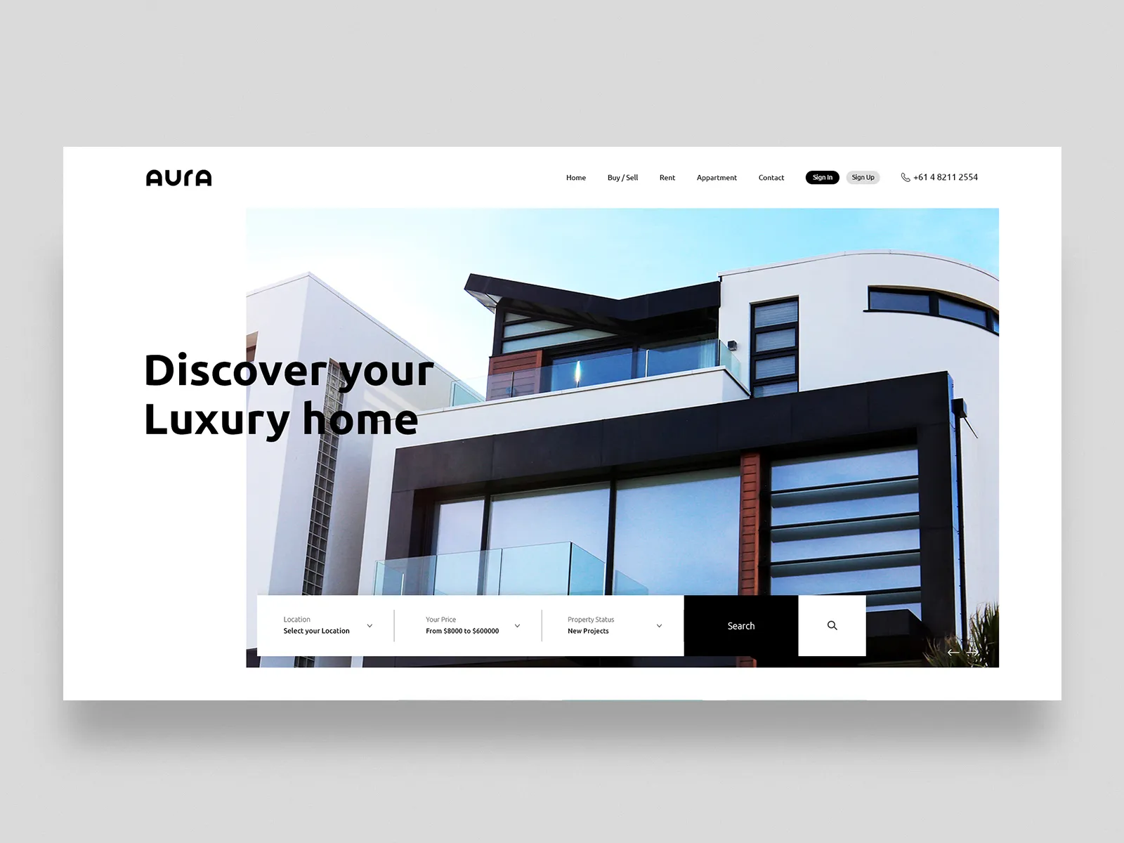
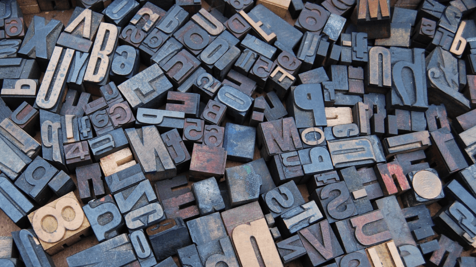
When it comes to creating a captivating and effective real estate website, one of the most crucial yet often overlooked aspects is font pairing. The right combination of fonts can evoke emotions, establish brand identity, and enhance the overall user experience. In this article, we will explore the top 10 font pairings that are perfectly suited for real estate websites. So, whether you are a real estate agent, a broker, or a property developer, read on to discover the ideal fonts that will leave a lasting impression on your website visitors.
Table of Contents
Understanding Font Pairing
Font pairing is the art of selecting two or more typefaces that complement each other, creating visual harmony and hierarchy while maintaining readability and legibility. When done correctly, font pairing can enhance the overall visual appeal of a website and improve user experience, making it easier for visitors to navigate and consume content. With countless font options available, choosing the right combination can be challenging, but understanding the basic principles of font pairing and experimenting with different combinations can yield impressive results.
Benefits of Font Pairing for Real Estate Websites
Improved User Experience
The primary goal of any real estate website is to provide users with a seamless browsing experience, enabling them to find relevant information quickly and efficiently. Effective font pairing helps achieve this by ensuring that text is easily readable and visually appealing, guiding users through the website’s content and minimizing confusion.
Brand Consistency
A consistent visual identity is essential for any business, and real estate websites are no exception. By using well-paired fonts that align with the company’s branding, real estate websites can maintain a cohesive look and feel, reinforcing brand recognition and trust.
Enhanced Visual Appeal
First impressions matter, especially in the competitive world of real estate. A visually appealing website can make all the difference in capturing potential clients’ attention and keeping them engaged. Skillful font pairing contributes to the overall aesthetics of a website, helping create a polished, professional look that instills confidence in users.
Examples of Effective Font Pairing on Real Estate Websites
Playfair Display and Roboto
Playfair Display is an elegant serif typeface, while Roboto is a clean, modern sans-serif font. This classic pairing creates a perfect balance between sophistication and simplicity, making it ideal for high-end real estate websites that cater to a discerning clientele.
Why it works: The contrast between the serif and sans-serif fonts adds visual interest and hierarchy, while the legibility of both fonts ensures a seamless user experience.
Rockwell and Open Sans
Rockwell is a bold slab serif font that commands attention, while Open Sans is a versatile sans-serif typeface with excellent readability. This combination works well for websites that need to make a strong statement, such as luxury real estate agencies or property developers.
Why it works: The slab serif font grabs attention, while the sans-serif font ensures readability and balance. This pairing creates a sense of authority and trustworthiness, essential for real estate websites.
Pacifico and Lato
Pacifico is a charming handwritten font that adds warmth and personality, while Lato is a sleek sans-serif typeface that keeps the design grounded and professional. This pairing is perfect for agencies that want to convey a friendly, approachable image to potential clients.
Why it works: The handwritten font adds a personal touch, while the sans-serif font maintains legibility and consistency. This combination helps create a welcoming atmosphere that encourages users to explore the website further.
Montserrat and Merriweather
Montserrat is a modern, geometric sans-serif font, while Merriweather is a traditional serif typeface with excellent readability. This pairing creates a harmonious balance of contemporary and classic styles, suitable for a wide range of real estate websites.
Why it works: The contrast between the sans-serif and serif fonts adds visual hierarchy and interest, while the legibility of both typefaces ensures a user-friendly experience.
Raleway and Source Sans Pro
Raleway is an elegant sans-serif font with a touch of sophistication, while Source Sans Pro is a versatile sans-serif typeface designed for readability. This combination is perfect for real estate websites looking for a clean, minimalist design that still exudes class and professionalism.
Why it works: The similarity in style between the two sans-serif fonts creates consistency, while the subtle differences in weight and structure add depth and visual interest.
Oswald and Noto Serif
Oswald is a bold, condensed sans-serif font that works well for headlines, while Noto Serif is a highly legible serif typeface ideal for body text. This pairing creates a strong visual hierarchy and a sense of reliability, making it perfect for real estate websites that want to convey trust and expertise.
Why it works: The contrast between the condensed sans-serif and the traditional serif fonts adds visual variety and emphasizes important information, while the legibility of both typefaces ensures a smooth user experience.
Libre Baskerville and Poppins
Libre Baskerville is a classic serif font with excellent readability, while Poppins is a modern, geometric sans-serif typeface. This combination creates a timeless yet contemporary look, perfect for real estate websites that want to appeal to a wide audience.
Why it works: The pairing of a traditional serif font with a modern sans-serif font balances old-world charm with contemporary flair. The legibility and contrast between the two typefaces make for an engaging and user-friendly experience.
Archivo Black and Nunito
Archivo Black is a bold, impactful sans-serif font, while Nunito is a friendly, rounded sans-serif typeface. This pairing works well for real estate websites that want to convey energy and excitement, such as those targeting a younger demographic or featuring unique properties.
Why it works: The contrast between the heavy, assertive Archivo Black and the softer, more approachable Nunito creates a dynamic visual hierarchy that captures users’ attention and keeps them engaged.
Amatic SC and Josefin Sans
Amatic SC is a quirky, handwritten font that adds character and personality, while Josefin Sans is a clean, minimalist sans-serif typeface. This pairing is perfect for real estate websites that want to stand out from the crowd and showcase their unique brand identity.
Why it works: The combination of a distinctive handwritten font with a more understated sans-serif font creates a visually engaging design that highlights the website’s individuality without sacrificing readability.
Abril Fatface and Karla
Abril Fatface is a bold, high-contrast serif font inspired by classic typography, while Karla is a versatile, humanist sans-serif typeface. This pairing creates an elegant, sophisticated look that’s perfect for upscale real estate websites or those targeting a luxury market.
Why it works: The striking contrast between the dramatic Abril Fatface and the understated Karla adds visual interest and hierarchy, while the legibility of both fonts ensures a user-friendly experience.
Implementing Font Pairings on Your Real Estate Website
To test and implement these suggested font pairings on your real estate website, consider using tools like Google Fonts or Adobe Fonts, which offer a wide range of free and premium typefaces. Experiment with different combinations and preview them on your website to see how they affect the overall design and user experience.
Remember that the key to successful font pairing is finding the right balance between visual interest and readability. Don’t be afraid to iterate and adjust until you find the perfect combination that enhances your website’s aesthetics and improves the user experience.
Future of Font Pairing in Web Design for Real Estate
As web design trends continue to evolve, font pairing will remain a crucial aspect of creating visually appealing and functional real estate websites. With advancements in technology, designers now have access to a vast array of fonts and tools that make it easier than ever to experiment with different pairings and find the perfect combination for their projects.
In 2024, we can expect to see a continued emphasis on font pairing that prioritizes readability, user experience, and brand consistency. Designers will likely explore more diverse font pairings, incorporating variable fonts and responsive typography to create websites that adapt seamlessly across devices and screen sizes.
Additionally, as artificial intelligence and machine learning become more prevalent in the design industry, we may see tools that can automatically suggest optimal font pairings based on user preferences and industry trends, streamlining the design process and allowing for even more creative experimentation.
Conclusion
Congratulations on making it this far in this extensive guide. I truly appreciate your dedication to learning about Font Pairing for real estate website. Your suggestions will be taken into account to ensure that this guide is continually improved.
Also Read: The Complete Guide to Color Theory And Its Application
In conclusion, font pairing is an essential aspect of web design that can significantly impact the success of real estate websites. By choosing the right font combinations, real estate website owners can improve user experience, maintain brand consistency, and enhance their site’s overall visual appeal. As we look ahead to 2024, we can expect font pairing to remain a vital component of web design, with new technologies and trends offering exciting opportunities for innovation and creativity in the real estate industry. So whether you’re building a new real estate website or revamping an existing one, don’t underestimate the power of font pairing – it could be the key to unlocking your website’s full potential.


